Indices Return Probabilities

Image Link – https://drive.google.com/file/d/1lrEJR94p606xxcwRPOtf0SSDYNWNJN0k/view?usp=sharing

Introduction

With the disappearance of alpha in large cap active mutual funds, midcap, smallcap and index investing is becoming more popular everyday with the masses, and factor based investing is gaining traction amongst the more savvy investors, thus this is a good time to understand what has happened and is going on the Indian indices space.

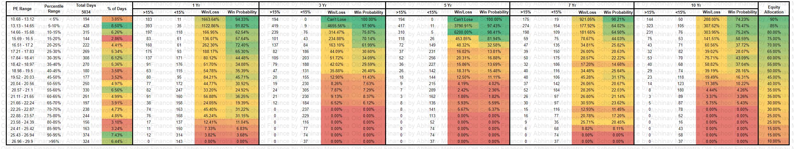
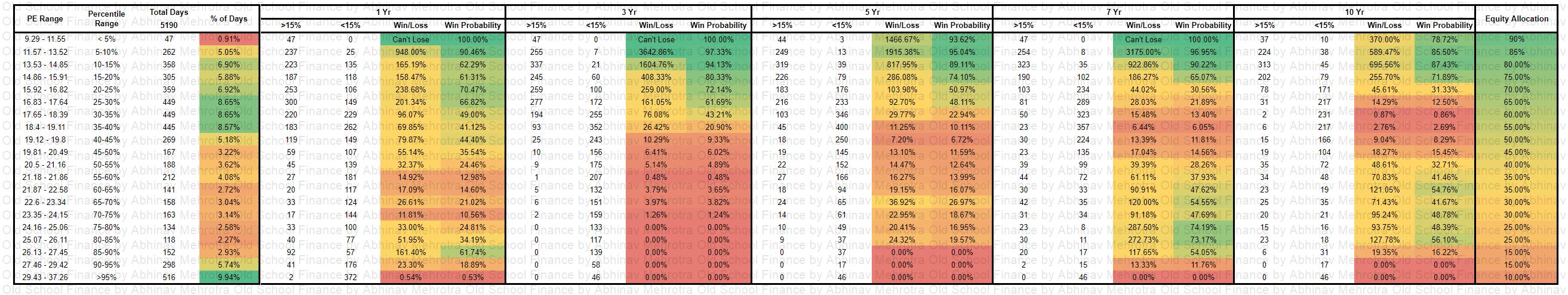
In the image linked above, I have summarized all the data points in one place. I have calculated the probabilities of earning greater than 12+% CAGR over rolling periods of 3/5/7/10 years. This exercise has been done for the 11 most popular indices for which various ETFs and index funds are available or coming up soon. We could not find long enough time series data for the smallcap indices to draw meaningful conclusions and thus have skipped them.

How are the probabilities calculated?

The probabilities are calculated by dividing the rolling periods which show greater than 12% CAGR by the total rolling periods in the relevant time frame.

Time Series Selection

I have used datasets from two different time series, one is from the inception of the various indices and one is from start of the year 2010. This has been done because market behaviour, and returns evolve as the tools the participants use evolve and as more participants enter the market. This made it necessary to look at more recent data of the last decade and remove the extreme market movements that happened during the older market regimes of the two decades before it. Such extreme movements are less likely to repeat as the markets are fundamentally very different now.

Return Threshold

I chose 12% as the threshold for returns because it is neither too aggressive nor too conservative in terms of return expectations from equity asset class. If you wish to change this assumption, I have linked the google sheet below which you can use to do the same probability calculations for different return expectations. The sheet is only limited by the data availability of Google Finance.

Time Periods

I chose to start with 3 years rather than 1 year because I believe 3 years is the minimum timeframe one should be invested for in the equity asset class. 1 year average return data has been included to provide a full picture of returns. One should compare these with the maximum and minimum return possible in 1 year to understand the risk associated with equity as an asset class.

Probability Classification

In terms of probabilities, I believe anything above 75% are good odds and thus have been highlighted in green. Probabilities between 50% and 75% are in yellow and below 50% are in red.

3 Year Time Frame

To start off with the 1st table, for a time period of 3 years, the odds are very much against you to even earn a 12% CAGR return in the headline indices. The factor based indices increase the odds but not by much. It is interesting to see how the probabilities reduce for the largecap indices when we compare the total dataset with that of the recent decade. The midcap and microcap indices show the greatest improvement in probabilities in the last decade.

Conclusion: The NSE200MOM30 is the best bet based on the last decades data.

5 Year Time Frame

Over a 5 year time period, the probabilities just crash overall, I am not sure what is the reason for this divergence. In the more recent decade, the difference is even starker. This paints a very grim picture for investing for 5 years in Indian indices.

I would love to discuss this with my peers and market veterans as to what may be the reason for this divergence.

There was an error in my calculations for the 5-year figures which have been corrected now. It is no surprise to see that midcaps, microcaps and factors outperforming headline market cap based indices.

Conclusion: The NSEMICROCAP250 is the best bet based on the last decades data. The NSE200MOM30 is the best bet based on the last decades data.

7 Year Time Frame

Over a 7 year time period, the Indian markets redeem themselves from their poor performance over the 5 year time periods. The probabilities are heavily in your favor if you skip the main large cap indices and pick midcaps, microcaps and factor based indices. NIFTY NEXT 50 deserves a special mention here as it shows the odds in your favors in both recent past and since inception.

The factor indices hit the ball out the park when we consider the recent decade, the odds couldn’t be better than this. But it remains to be seen whether such performance will continue into the next decade or will they fall prey to mean reversion.

Conclusion: Over the last decade, you could have picked the midcaps, microcaps, NN50 and factor based indices and would have easily earned more than 12% CAGR with near 100% surety.

10 Year Time Frame

For the 10 year time frame, it is more relevant to look at data from inception as the time series is longer. I have included the probability data from the last decade but there are only 342 10-year rolling periods and drawing any conclusion from this small dataset is not advised.

Here again, the factor based indices outshine the market cap based indices with the exception of NN50. The midcap index was basically a flip of a coin.

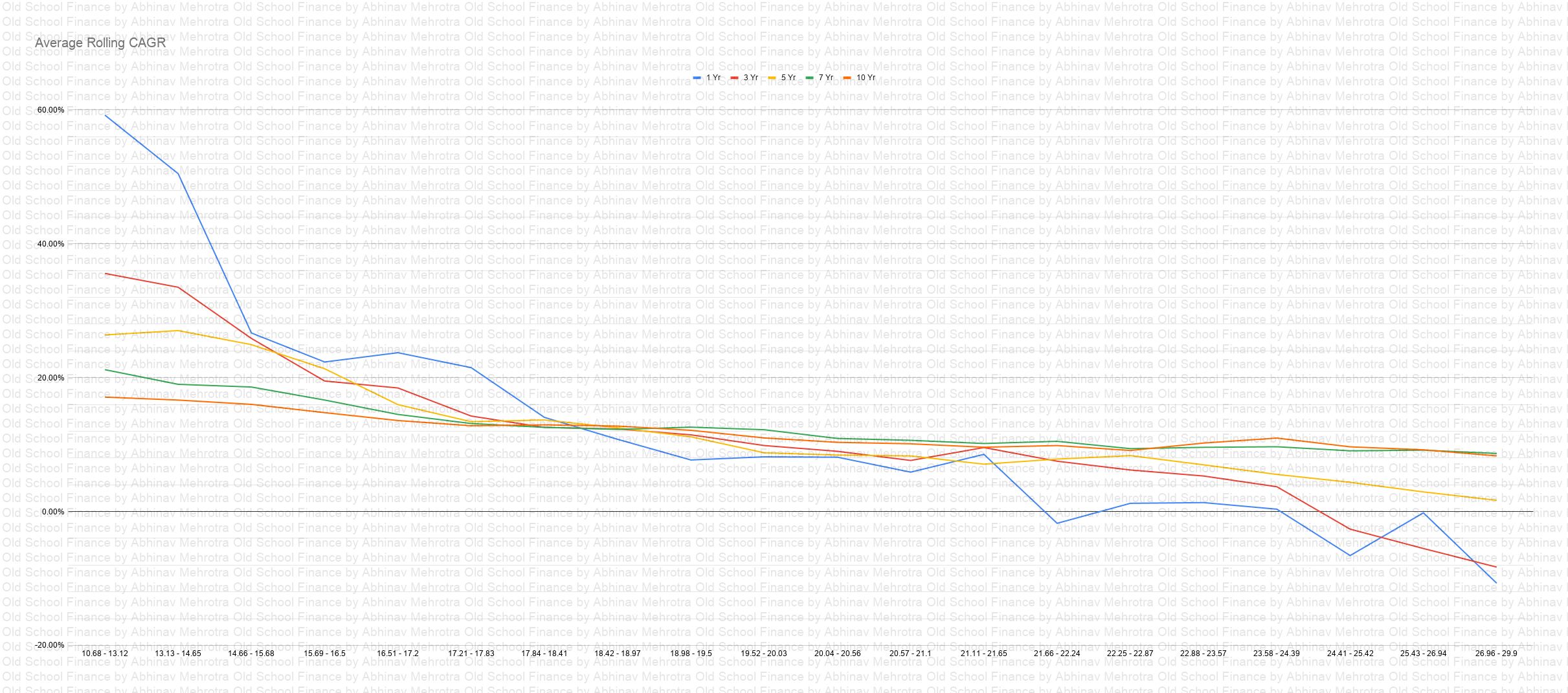
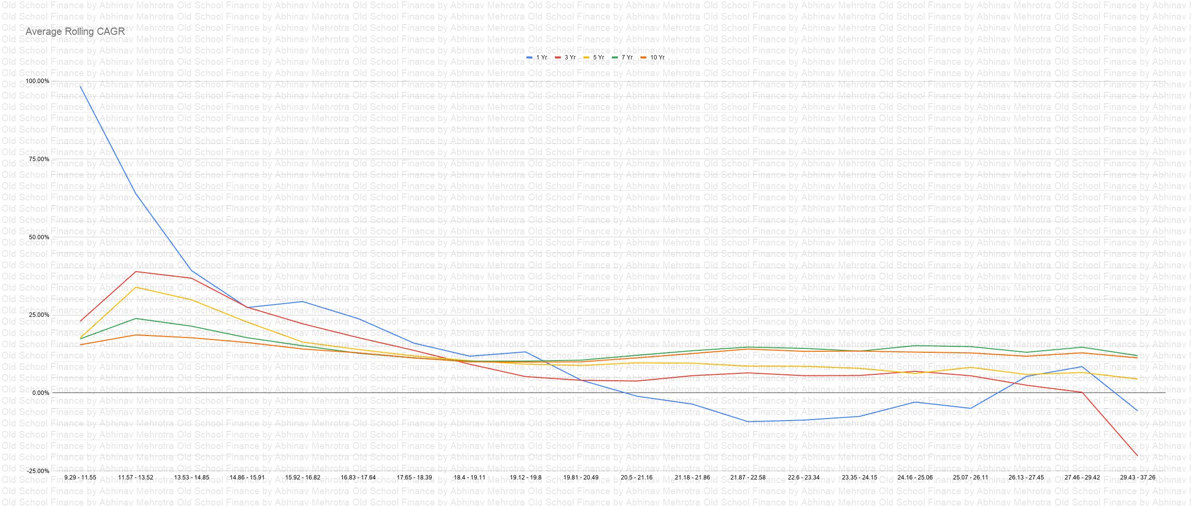
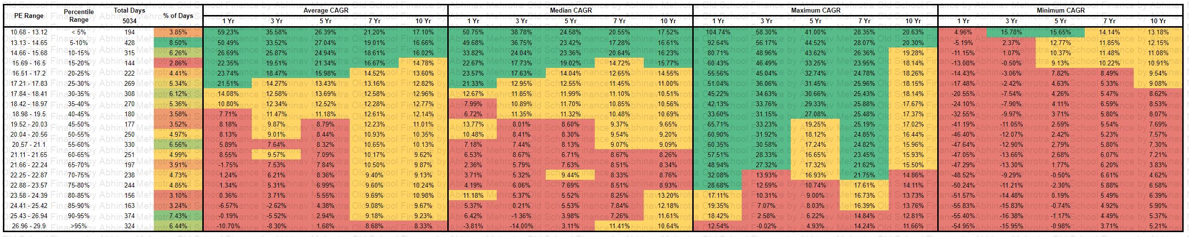
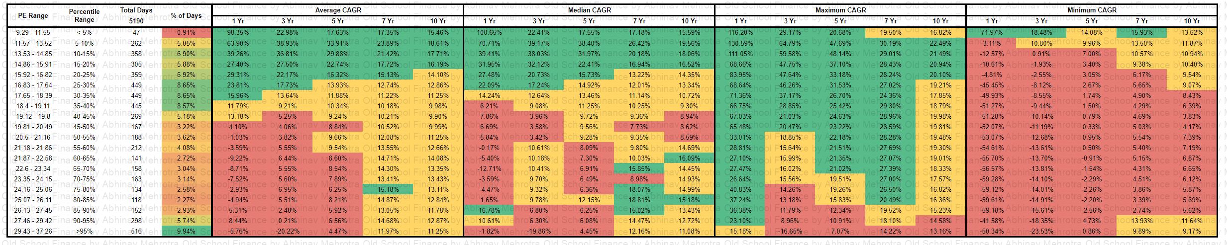
Average Rolling Period Returns

In the last two tables, I have shared the average rolling period returns for the same indices for 1/3/5/7/10yr time frames. Again I have used different data sets, one from the latest decade and another from inception.

Averages have a way of hiding the ups and downs of an index. If you want even more data on the maximum, minimum returns in these periods, their standard deviations etc. you can use the sheet I have linked below.

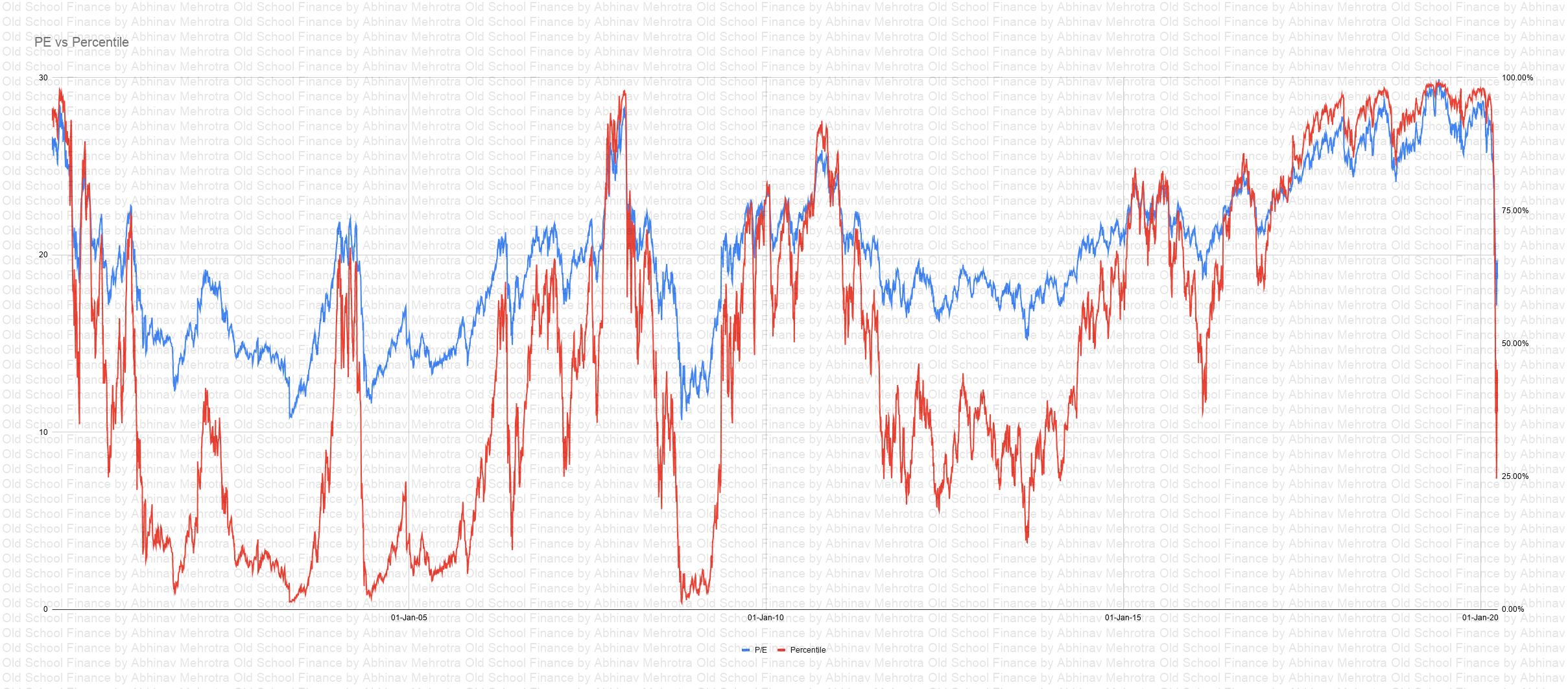
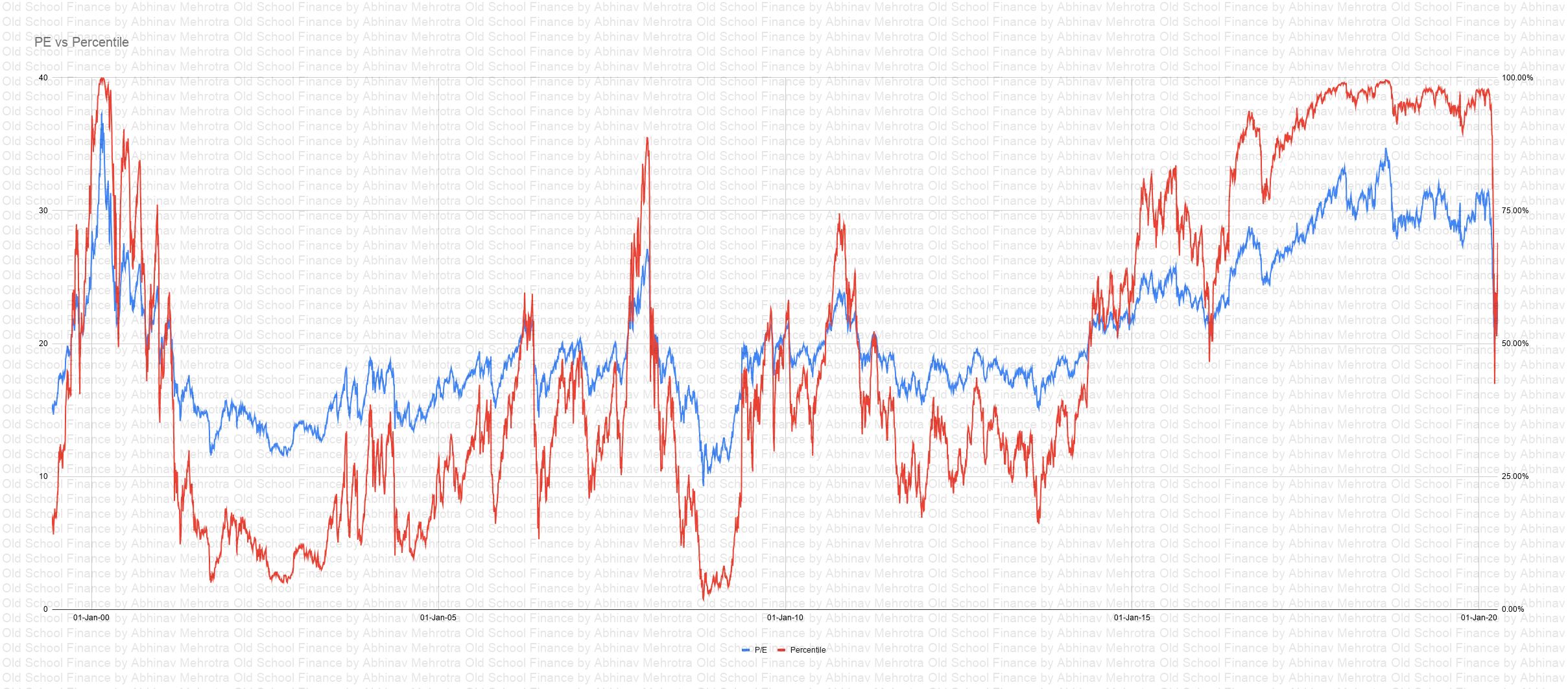
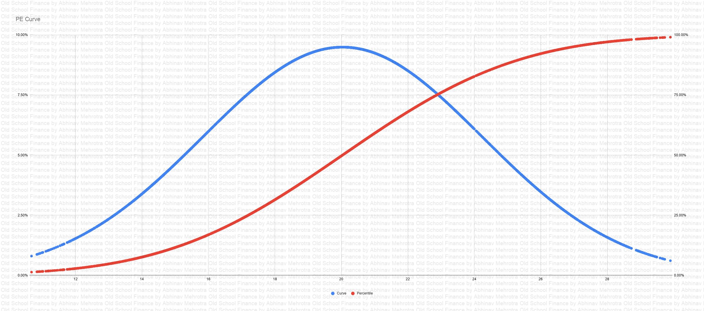
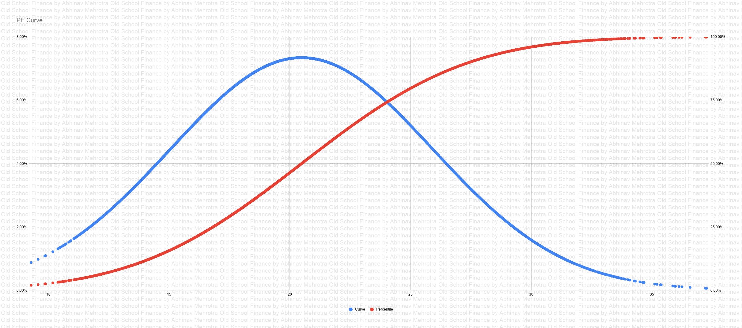
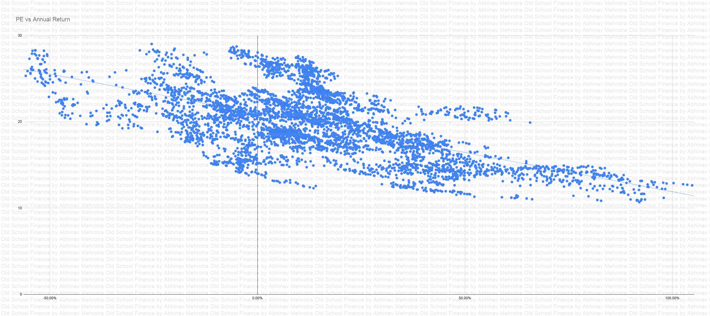
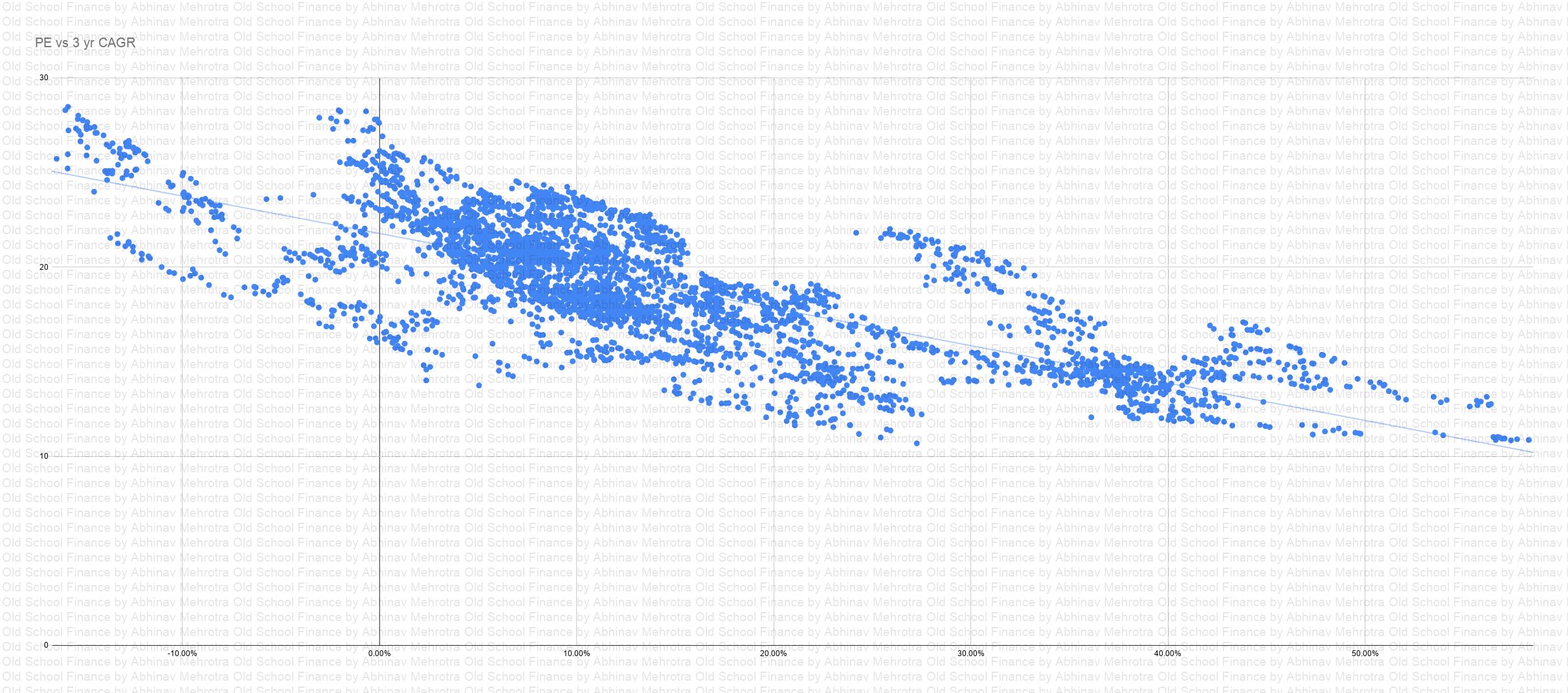
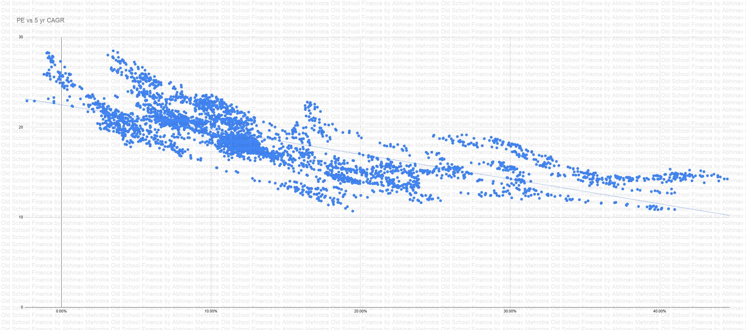
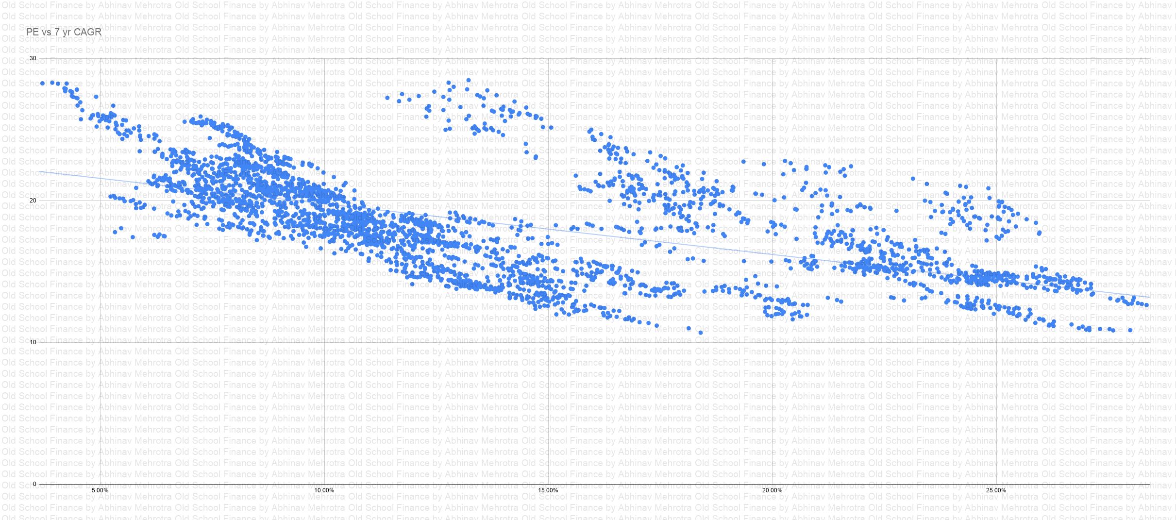
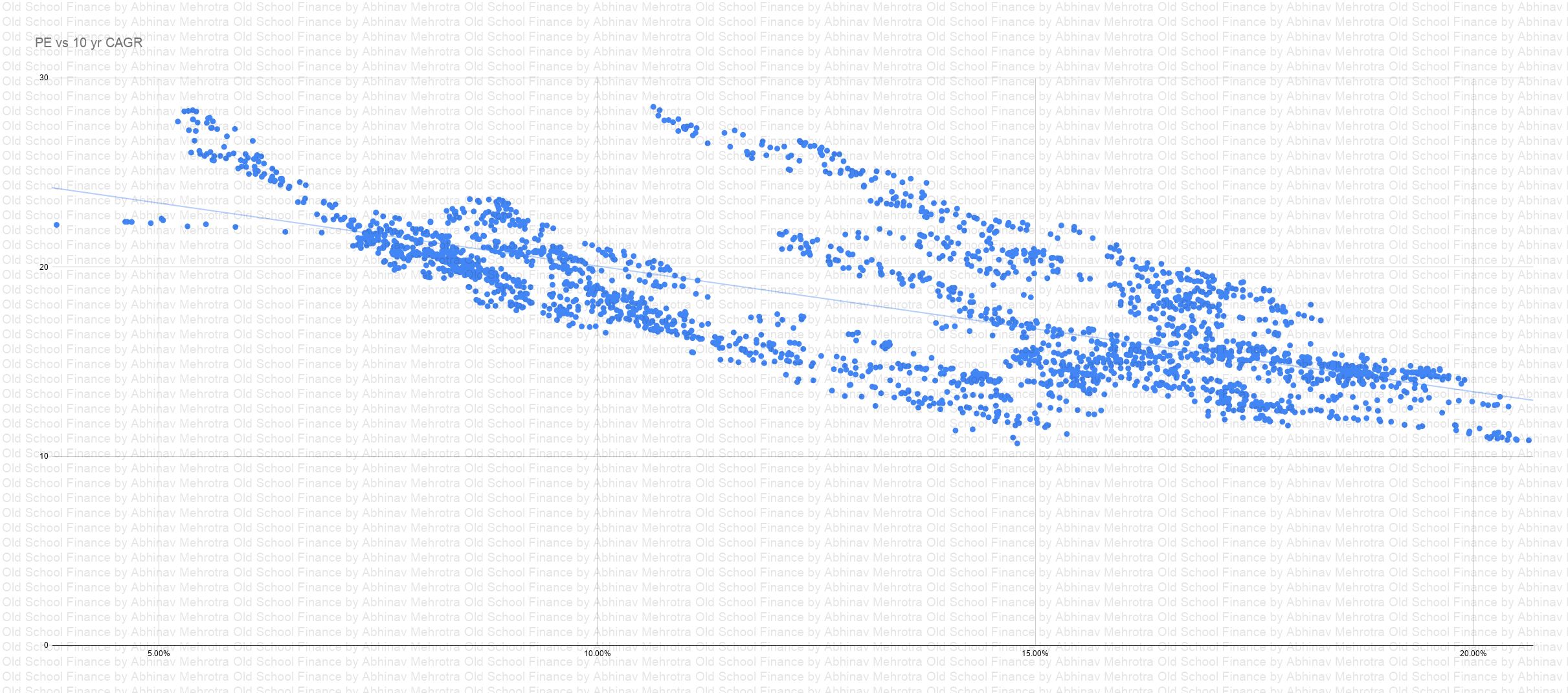
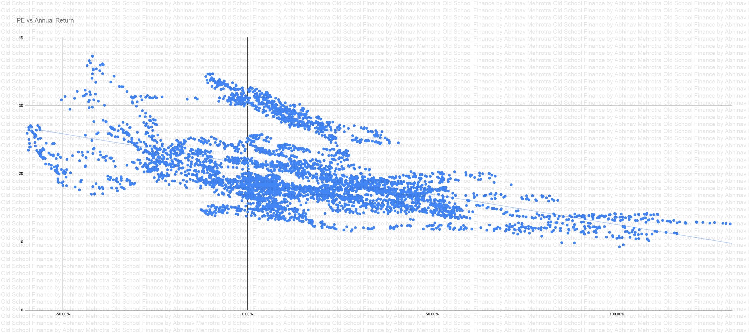
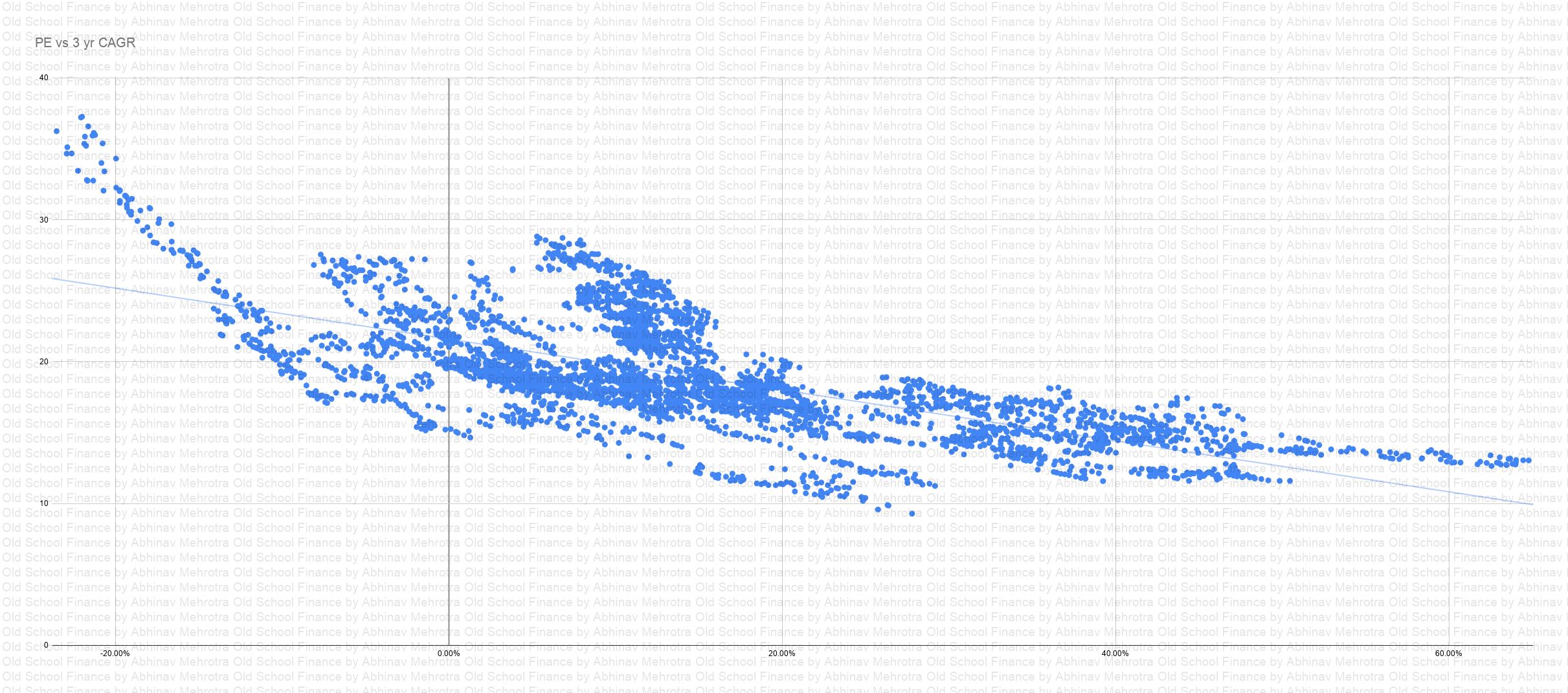
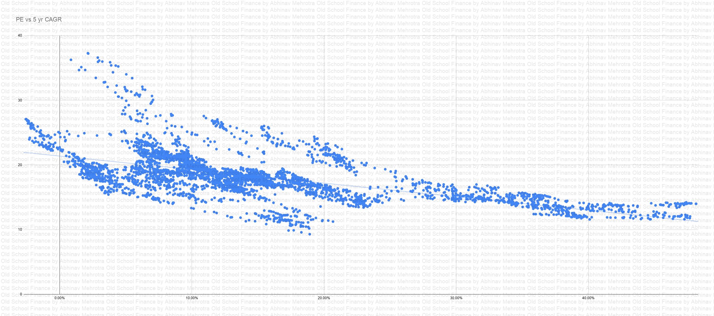
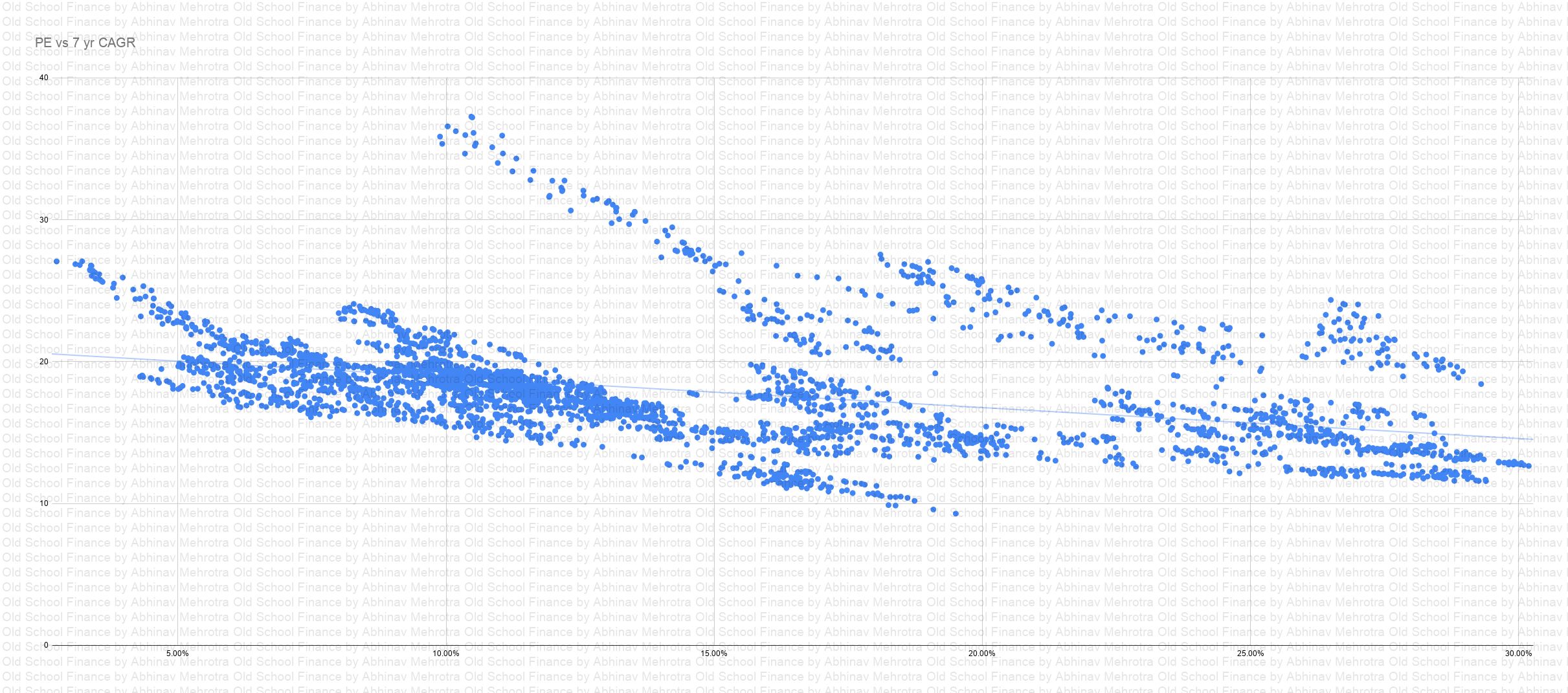
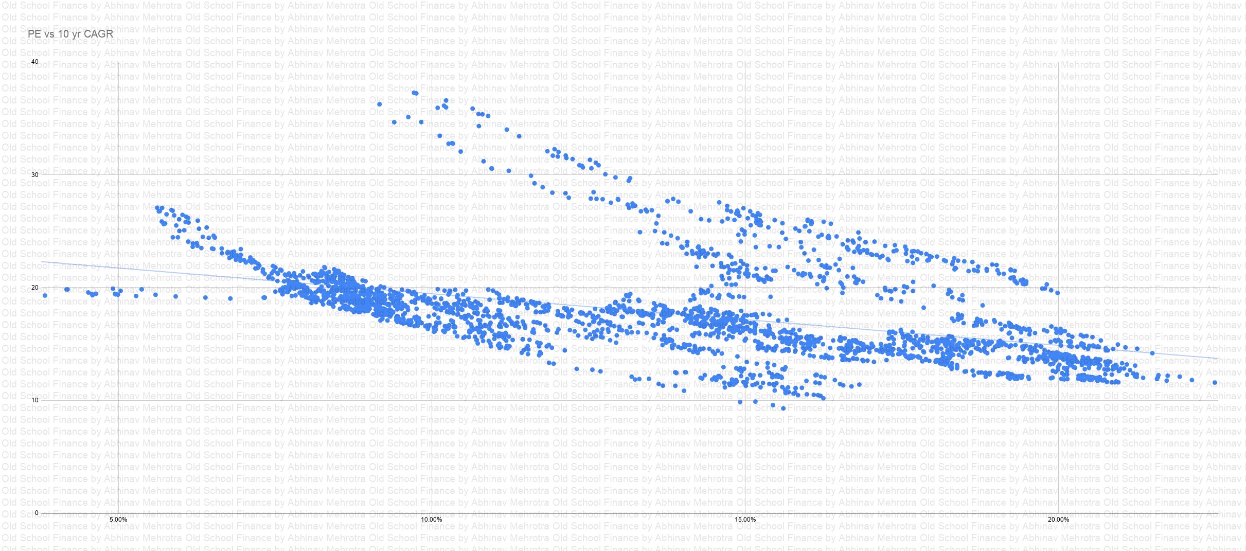
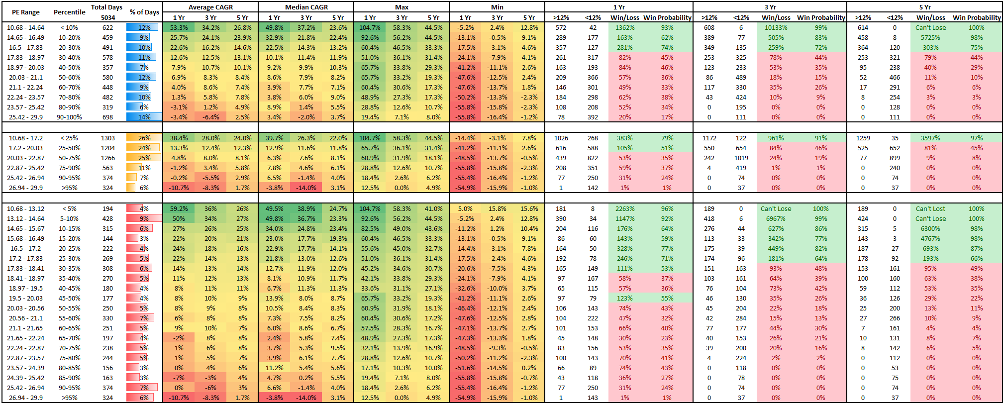
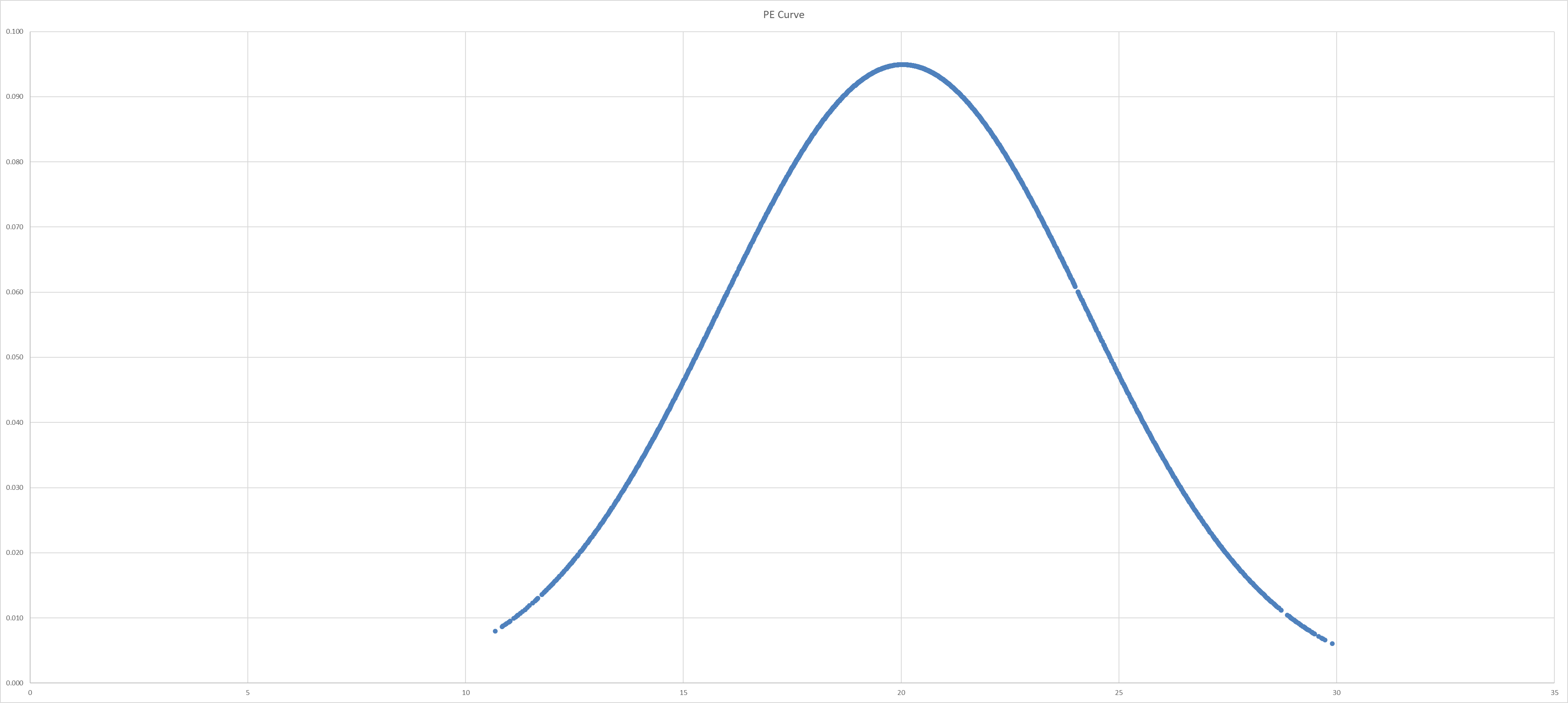
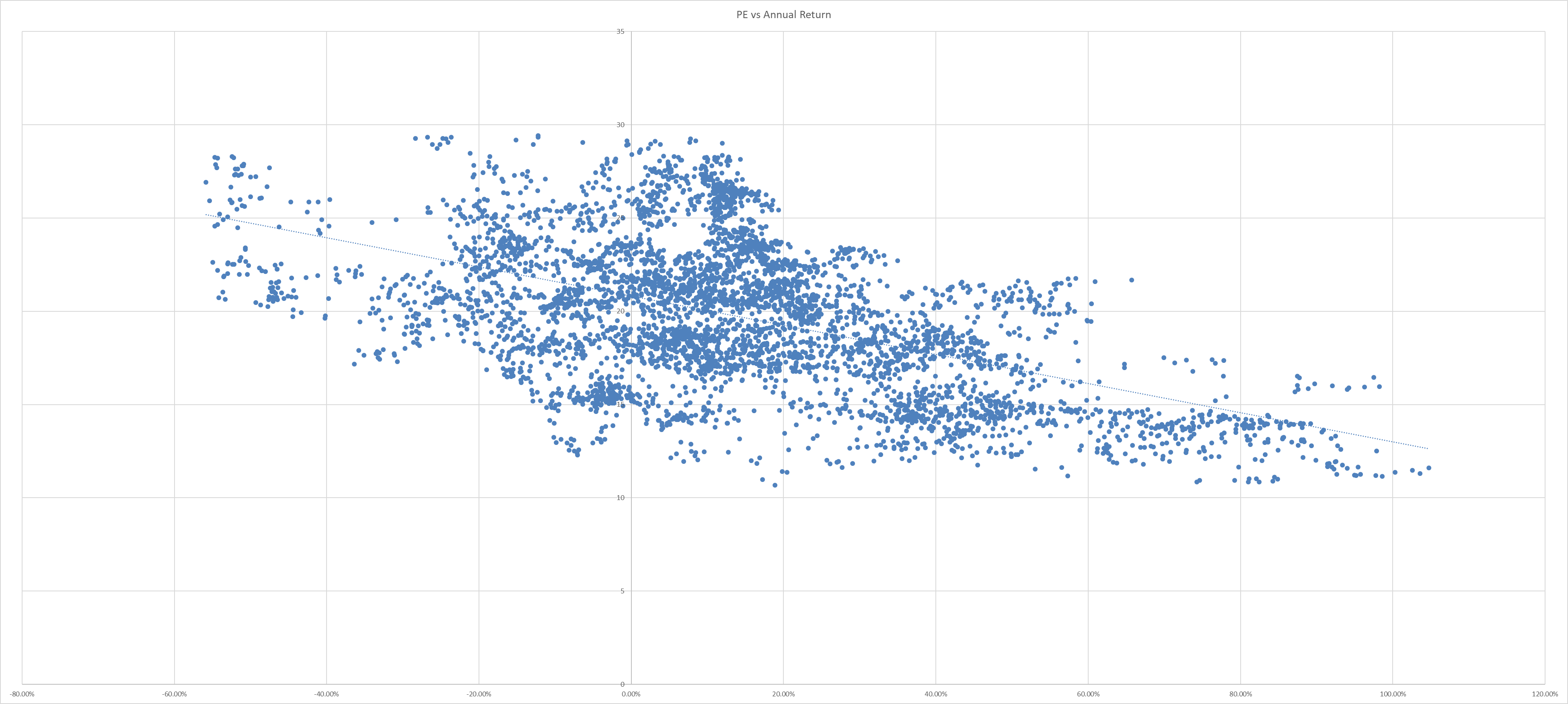
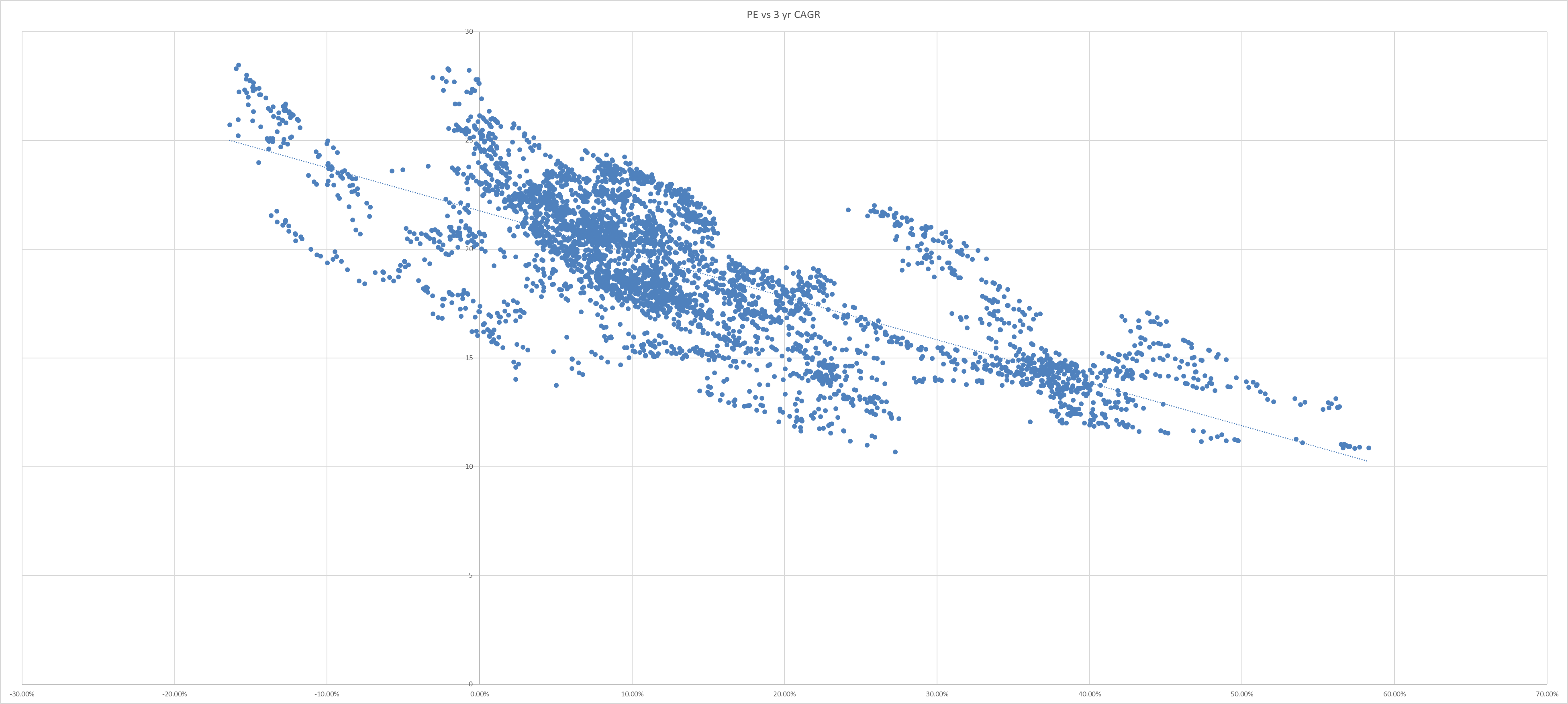
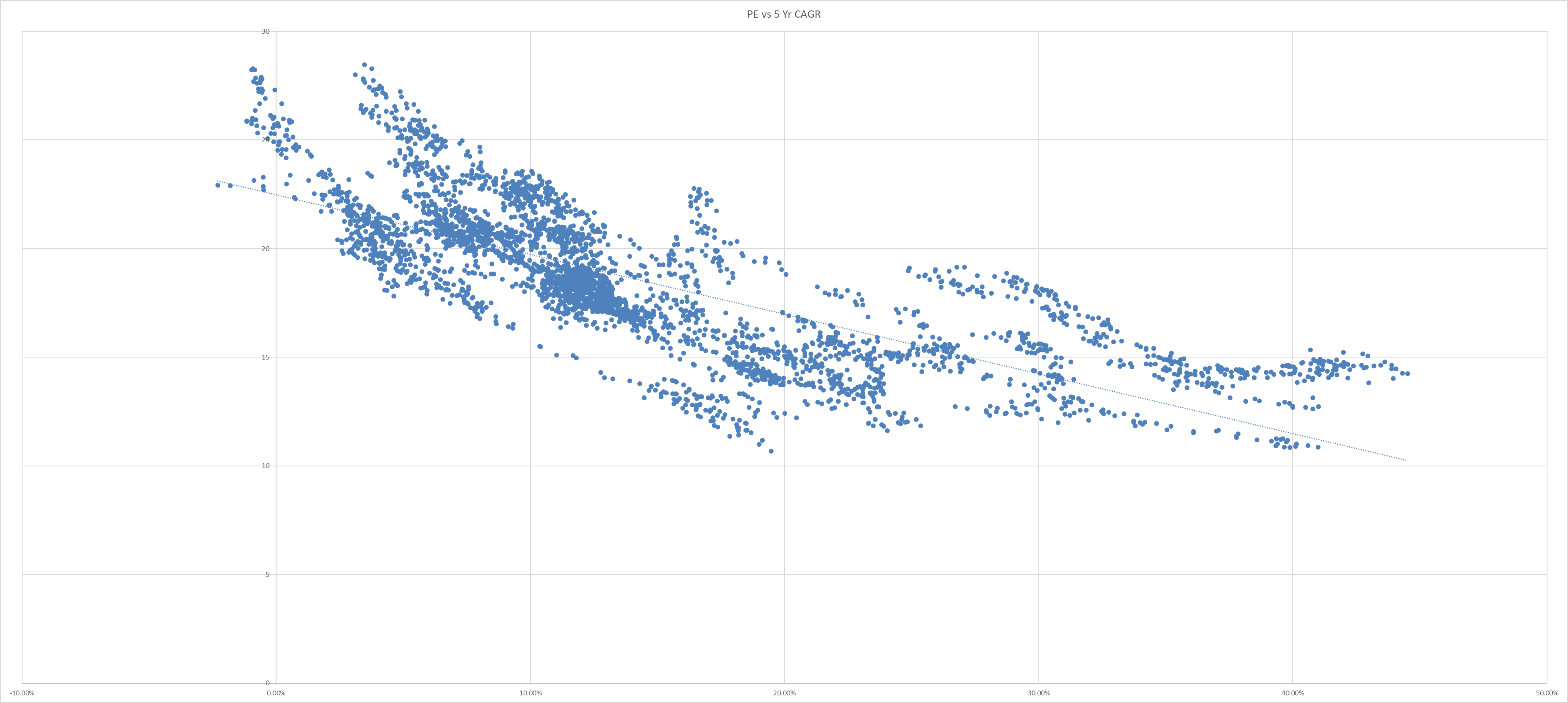
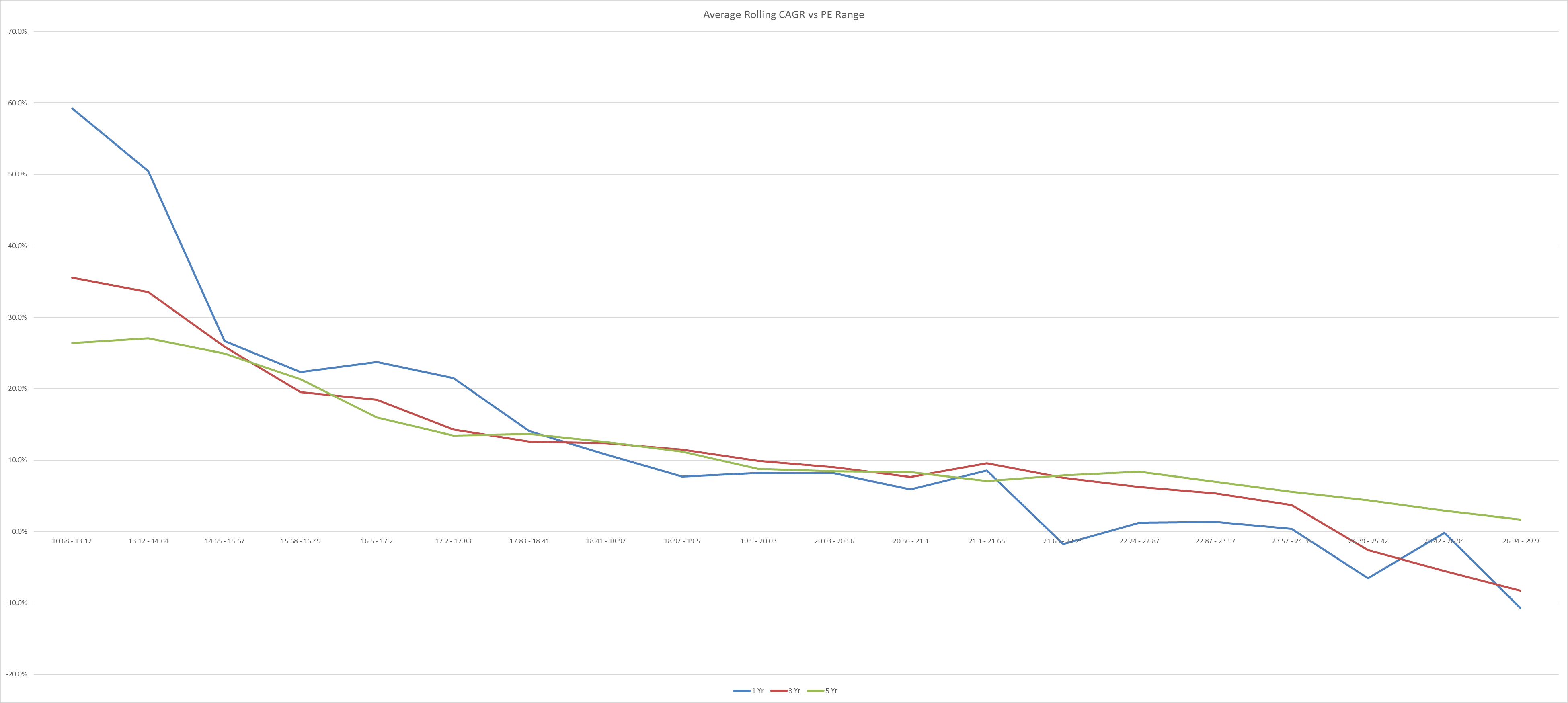
In a more high level analysis, I have already shared the link between PE and the rolling period returns for NIFTY50 & 500 indices in a previous blog post.

On an average basis, since inception the NN50 and factor based indices outperform the market cap based indices in all timeframes. If we consider only the last decade’s data even NN50 drops the ball and factor based indices just hit a home run in every time period.

Conclusion

Overall, it seems like the factor based indices are generating significant alpha over the market cap based indices. But whether the historical outperformance will continue is anybody’s guess. The odds are surely in their favor. Factor based investing has just started in India, and it will be no surprise if more capital chases this outperformance in the next decade.

However, with size will come impact costs and as factor based AUMs get larger I believe the alpha generation will slow down. But given the difference in current AUMs, this problem should be a long way off.

Google Sheet: https://docs.google.com/spreadsheets/d/17fLhGV_lBmRbdiNlf2SAvg0Q7JrBiK_OamFlVYhnuWY/edit#gid=744304526

Disclaimer:

  1. The data on Google Finance is only available for the first 5 indices and has different start dates to the data with NSE.
  2. While we have tried to maintain the data accuracy, we can in no way guarantee that the data is 100% correct.
  3. Please do not treat this as investment advice. We have only provided you with the data to make your own well informed decision. We in no way are recommending one investment product over another in this blog.
  4. We have not considered the impact of expense ratios on the indices’ returns. Generally, expense ratios for normal index funds will be lesser than or equal to that of factor based indices.
Standard

Building a DIY Momentum Screener on Google Sheets

Before you start building a screen you need to understand what factor based trading strategies are and how momentum, which is a subset of factors, has performed over the centuries.

Below is a repository of all the research material I have collected, this is, by no means complete, I keep adding new materials as I chance upon them. This will definitely give you a good idea of the strategy before starting.

https://drive.google.com/drive/folders/17FX9ps3CKAEoU8UgVVey7EsQ4V0hoisj?usp=sharing

Beyond this you should listen to the podcasts on YT by channels like ‘Chat with Traders”, “Top Traders Unplugged” where best of the best who have been doing this for decades share their knowledge of trend following systems.

So moving on to the screener, google sheets is sort of the easy way of doing this. Do note that google sheets will not allow you to do back tests on your strategy. For that you need to know a coding language and obtain clean corporate action adjusted data from the exchanges.

Most of these data feeds are paid, you can build a system where you download the entire historical data from a feed once and then append the data from google sheets everyday.

More creative people can scrape the data from exchange websites for free. If I remember correctly there was a CFA society video by Parijat Garg on this subject.

Back testing is sort of important when you add certain conditions to your strategy, but it is not the holy grail. So you can do without back testing if you have faith in your system.

Here is a sample of what I have built on google sheets. This is just to tell you that if you are decent in excel, you can build it yourself and run your momentum strategy without knowledge of coding.

To give a few pointers,

  1. Define you stock universe – Can be 50/100/200/500 or all stocks.
  2. Get the tickers from NSE website.
  3. Define your lookback period.
  4. Get the price data for each of the stocks in your universe for the above lookback period and current price.
  5. Calculate the % change in price and sort them based on this.

The above is the simplest form of momentum. You can even build a ranking system based on Sharpe, Sortino and various other factors mentioned in the repository above. But it will require some more data in the sheets. Alternatively, you can even find these rankings based on look back period return, Sharpe etc. on websites like askkuber, valueresearch, tikr and many others.

For Sharpe ranking the steps are as follows,

  1. Get the tickers here – https://www.nseindia.com/products-services/indices-broad-market
  2. append NSE: to each ticker using =”NSE:”&cell. This ensures only data for India tickers is returned be Google Sheets.
  3. Use =googlefinance(ticker,”close”,today()-365,today()) to get the past 12 months daily data. If you want data for a different lookback change the 365 figure. Using today() will ensure you don’t need to change the data every time you rank. You will need to get this price data for each ticker in a new row. If the GF formula returns a header, use the index function before the formula to remove the headers.
  4. Calculate daily % change, and then calculate its STDEV for each stock. Annualize the STDEV by multiplying by sqrt(252).
  5. Calculate 12M ROC for each stock. This is the CMP divided by the closing price 1 yr back -1.
  6. Divide 5 by 4 for each stock to get its Sharpe. Then rank by Sharpe.
  7. A single Google sheet might only work properly for up to 500 stocks. If your universe is larger I would advise to breakdown your stocks into universes of N100, Midcap150, Smallcap250, and Microcap250. If you want to do all stocks then you can get the tickers for those as well from NSE website and label them as nanocaps and rank them in batches of 250.
  8. Finally, use the import function to call the data to a consolidated sheet.
  9. If you want a different lookback, say 3/6/9 months change the parameters accordingly.

You can also use screener.in to build such a screen, just use the equations below and sort them based on 1 Yr returns in descending order,

Percent from ATH > -25% AND
Market Capitalization > 1000 AND
Return over 1year > 0

Per cent from ATH is a custom ratio I built in the screener. One can build it yourself using the formula,

(current price/high price all time – 1) * 100

Another way to build a momentum screen if you are not familiar with google finance or coding is to just download the bhavcopy from the exchanges for the dates you are interested in. Ex. one will be for today, and another will be sometime in the past, say 6/9/12 months. Just take the close prices between the two dates, calculate the % change and rank in the order of descending returns.

Besides this you will also have to make decisions on your portfolio diversification, weightage, entry/exit strategy, filters, and rebalancing frequency etc. This is how everyone builds a system that they are comfortable believing in and following when momentum crashes happen. You will have to go through the research to build a system that suits your personality.

If you have read till here, obviously you are interested in DIY momentum strategy but just in case someone is completely new to the momentum bandwagon, and you are intimidated by sheets, there are a lot of small case providers who will run the strategy for you for a fee. Most people want to DIY because these small cases are black boxes and their detailed strategy is unknown. They are also relatively new and it is difficult to know how they will perform in a downturn. Lastly, some even find them costly.

Depending on your portfolio diversification, if you want to follow the system perfectly you will need 2-6 lacs capital to start with. This figure is wide, the more you will diversify the more capital you will need. Some periods will require less capital and some more. If you are really constrained on starting capital, you should not be doing this in the first place. If you are still adamant you can remove the most expensive scrips till the portfolio reaches your capital level.

I share my momentum ranking calculations here:

https://abimehrotra.wixsite.com/mysite/research

To conclude with the important question, why momentum strategy? Well, the answer is simple. It provides a good strategy diversification to your portfolio. No strategy works all the time just as no asset class works all the time.

Disclaimers:

  1. Please do not construe this post as an investment advice. This is for educational purpose only.
  2. No investment capital is being solicited from the readers of this post.
  3. Momentum based trend following isn’t the holy grail, panacea of making money. Be aware of it.
  4. Beware of momentum crashes.
Standard

Sample Portfolio Tracker in Google Sheets

A few people were looking for a way to track their portfolios. Here is a sample tracker I have built on google sheets complete with charts, relative performance, asset allocation, portfolio and industry weights. I have not opened the sheet as ready to use as I believe such trackers should be built custom to ones need. The sheet will require adjustments, inputs from the owner from time to time as the portfolio changes. If you will just start using mine you will always be breaking the formulae, references etc. I advise to take this as a template and make it your own.

https://docs.google.com/spreadsheets/d/1IH9uTwLo2Ks-Du8RBWEx2xjFCPLX1iXLRcXDIGUuSJM/edit?usp=sharing


Disclaimers:

  1. The stocks in the sample tracker are picked at random, please do not consider the stocks, and their weights as investment recommendations.
  2. The returns shown in the sample are fictitious and no attempts are being made to solicit investment capital from anyone based on such fictitious returns.
Standard

NSE Technical Dashboard

Migrated the entire dashboard to: https://abimehrotra.wixsite.com/mysite/nse-technical-dashboard

WordPress is limiting the width of the embeds.


Notes:

  1. Std. Dev. is not annualized & is on LHS.
  2. Advance Decline Ratio is on RHS.
  3. This is a recent project. I do not have the data on from further back as the constituents keep changing.
  4. Chart would automatically be updated everyday.
  5. For more detailed charts of NSE500 you can check my post “Stock Price History Tool”. It has more detailed historic charts.
Standard

Operating leeway in Microfinance Lending Business Model

Microfinance industry used to be an industry which was hit with adversities once a decade, but since 2010 it seems some event or the other throws the wrench into the engine every few years now.

The lenders have learnt from each difficult situation thrown at them and tuned their business model in various ways to survive these in the future. But I doubt they would ever become immune or anti-fragile to such events.

After the AP crisis the lenders came together to form a code of practices that would help them avoid the political/public consequences/lash-backs of coercive collection practices. Who and how well these are followed is anyone’s guess. The situation on the ground is dynamic, even a pan-India survey would reveal information about the past and present and not how these lenders will behave in the future in times of crisis.

Demonetization would not have had such a severe impact on this industry if RBI had allowed NBFCs to collect old currency notes. One NBFC escaped the carnage by becoming a bank at the right time. Others were not so lucky. A few others did collect the old currency up to 4% of their loan book and 8.4% of the book was ever-greened to control NPAs. What was good about the crisis was that RBI did not allow any moratorium and true vulnerabilities of the industry were allowed to get out to the public. As you will notice in the charts below NPAs spike up after the 90 days delayed NPA recognition facility provided by RBI. The industry was able to provide for all loan losses from one financial year’s of profitability and the lending engine chugged on.

Corona virus has definitely brought about the biggest challenge the industry has had to face till date, whether this is the peak limit of difficulty any event can through at them or something bigger can also occur is an unknown unknown. Till now the nature of adversities has been such that their magnitude of disruption in the livelihoods of the borrowers is varied but majority of the damage is determined by the geographic scale and time duration of the adversity.

DEMON was pan-India event, but the duration impact to livelihoods was short lived. Here also I would define duration impact into two categories one would have been the immediate complete stop of business which is very short lived and another is a general slowdown in economy which is a more medium term impact.

Natural calamities also have a similar impact in disrupting livelihoods though their geographic scale is limited. Such disruption could range from complete wipe-out in certain cases to loss of income for a few weeks. In both situations the borrowers generally fall behind in payment schedules.

The lenders have, since the AP crisis and recent floods, famines focused on diversifying their loan book across the length and breadth of the country. I will touch upon the loss bearing capacity of the business model later on but unless we see mega devastating climate change influenced natural disasters like in the movies, the industry can absorb the losses from such events.

Coming back to the corona virus, the impact is yet to be seen given the moratorium, delay in recognition of NPAs, restructuring of loan schedules. The collection efficiencies have inched up to 70-80% in August-September for most lenders. There is a big discrepancy between institutions as well in the way they calculate the collection efficiency. Generally it should be the collections of the months divided by the total amount that was due to be collected without the moratorium impact, meaning collections due in normal business course. We shall investigate from here on how much hit on collection efficiency the business model can structurally absorb before getting into trouble.

Let’s start with the book yield, the average return the lenders makes on the loan book. These generally range from 15% to 24% for most lenders. While institutions used to have some control over these yields due to lower credit penetration levels across untapped geographies, general regulatory oversight and competition are forcing these down.

Then comes the cost of funds, which is what these lenders pay to their depositors (in case of SFBs/Banks) or to the institutions they borrow from. These costs are a function of market confidence in your institution, both depositors and lenders will give you capital for lower interest rates only if they have confidence in your lending practices and ability to get back the capital that is lent on forward. These are also affected by liquidity in the markets. The cost of funds for SFBs and banks have dropped more than that for NBFC-MFIs because of their access to retail deposits which are generally cheaper capital sources to institutional loans.

What is left after the cost of funds is the interest spread. The financing margin the institution makes.

The chart I have below is the NIMs (net interest margin) which is slightly different in definition from interest spread but serves the same purpose.

After this come the cost of operations, these are the cost of running the branches, employee expenses etc. The have ranged from 4% for the most efficient operators to 8% of the loan book. The management has some control over these costs, but the microfinance model is a high touch one and requires alot of differentiated personnel, systems, and services to chase after smaller quantum of capital. The general practice is to improve branch and employee efficiency and have them disburse and collect as many loans as humanly possible. The group center meeting model required a certain time investment which limited the scalability of these productivity metrics.

With the social distancing practices becoming prevalent after the virus spread many lenders have shown interest in tweaking their model to adopt technological solutions that will enable them to increase their collection and disbursement productivity multi-fold. A few have not expressed any such initiatives.

Time will tell how well such solutions can be integrated into the current business model and how it will affect the credit discipline of borrowers. There are a lot of moving parts here and where the ball will roll is difficult to ascertain but one thing is clear, if the productivity increases dramatically for such business models, the industry is figuratively keeping a larger gold pile in the center of the castle and I am not sure whether their entry barriers derived from higher costs, lower productivity and first mover advantage will protect them from bigger competitors.

This is perhaps the reasons also why bigger banks find it problematic to fit this borrower group into their high loan value business operations. They prefer to do this via an organic or inorganic subsidiary to keep the two separate.

These are the major cost heads of the industry, what comes after this determines the quality of the management in the lending space. Being able to disburse to good borrowers who are willing and motivated to repay back the loans is a skill in itself. The job only gets harder as credit penetration levels increase in a country. The prime borrowers are essentially locked in by the biggest of the banking institutions, what are left are definitely sub prime in conventional sense.

These borrowers have essentially unaccounted income sources which are sometimes irregular and have no particular assets to mortgage for a loan. The management has to find new buffer systems that mitigate some of these risks. The group lending and joint liability model is almost 3 decades old now, and while it has worked beautifully in ensuring a social pressure to pay back the loans taken, a few institutions have removed the joint liability covenant but still continue with group lending model. Perhaps they feel that the social embarrassment of not being able to pay back a loan is deterrent enough to enforce borrower discipline.

These measures work in good times but whenever difficulties arise, the borrowers are still easily hit, as they have little savings to fall back on and cannot payback the loan even if they want to.

So, the credit costs for these institutions range from near 0.5% in good times to 5% when difficult times hit. The GNPAs are also under 2% for most of the time.

What is left after all these costs is the profit which is depicted by the ROA of the institution. As can be seen in the chart, the business model of all institutions have these costs baked in to the book yield to earn decent profits every year. The years in which exceptional disruptions happen the industry is able to pay for the losses from one year of profitability.

It remains to be seen whether the last statement above will remain true in the COVID aftermath. Most institutions have started providing for expected loan losses from the last quarter of the FY20. They have already built up provisions of anywhere between 1-2.5% of the book and they still have 3 more quarters of FY21 to provision from.

That being said, if you look at the averages, with a book yield of 20%, cost of funds of 9% and OPEX costs of 6%, the average institution should have the ability to absorb 5% of credit costs in a year before dipping in to their balance sheet reserves. This is the ideal scenario which says the industry can absorb losses up to a collection efficiency of 95% below that is troublesome.

We still have a long way to go from current 70-80% CE to 95-99% efficiency and it is the last bucket which is the most troublesome to regularize. Once the NPA recognition starts we will get to know the real damage and how long it will take to normalize operations. My guess is that it will take the industry 1-1.5 years to normalize back.

Hi-Res Charts – https://drive.google.com/drive/folders/13pqwYX4cFPIbVxOEfrM5Z7zGx6Uf3GlM?usp=sharing

Disclaimer: This post is for research purposes only. Please do not construe this as a buy/sell recommendation.

Standard

Mahindra & Mahindra Financial Services

A data dump of MMFS I have collected from my financial services sector collection. Hi-Res images of the charts are available at the end of the post.

Consol % Annual

Annual Figures

Annual Data above, GNPAs and NNPAs are troubling, especially when vehicle financing for parent company forms a large chunk of the loan book. Provision coverage ratio has been reducing, which is a bad trend, I doubt the loan book composition has changed so drastically over the past 5 years that such a drop is warranted.

One can argue that the lending is secured, but vehicles are a depreciating asset, high LTVs in this space could be problematic as well. I was not able to find the LTV norms the company follows in my data collection. I am sure it can be attained if one contacts the management.

Consol % FY19 Q

FY19 Quarterly Figures

Quarterly Data for FY19, the ROA/ROE data is annualized, credit cost figures are interesting.

Consol % FY20 Q

FY20 Quarterly Figures

Quarterly Data for FY20, ECL trending up.

Consol ABS Annual L+BVPS+DE

Annual Figures

Book value per share has seen good growth, leverage maintained.

Consol ABS Annual LB+B

Annual Figures

Loan book doubled in 5 years.

Consol ABS Annual

Annual Figures

The sudden spike FY17 in NPA figures could be due to an acquisition or a subsidiary merging into the company.

Consol ABS FY19 Q LB+B

FY19 Quarterly Figures

FY19 Quarterly Asset & Liability trend.

Consol ABS FY19 Q

FY19 Quarterly Figures

FY19 was a good year for the company overall.

Consol ABS FY20 Q LB+B

FY20 Quarterly Figures

FY20 Quarterly Asset & Liability trend.

Consol ABS FY20 Q

FY20 Quarterly Figures

FY20 was steady overall, Q3 saw good demand for loans, while the auto sector was struggling. Would be a good exercise to check the segmented disbursements for that quarter.

Seg % Annual

Annual Figures

Share of MSME in the loan book is reducing. Geographical diversification is maintained. Share of Commercial vehicles in the loan book is inching up. 27% and 17% of the book is built by financing parent’s private vehicles and tractors.

Majority of the capital is sourced from banks, the portion of capital sourced from mutual funds via commercial paper had reduced.

Company has a 12% market share vehicle financing sector.

Seg % FY17 Q

FY17 Quarterly Figures

Steady disbursement and loan book mix in FY17.
Seg % FY18 Q

FY18 Quarterly Figures

Commercial and used vehicles financing gaining share in FY18 within vehicle loan book.

Seg % FY19 Q

FY19 Quarterly Figures

Focus on commercial vehicles further increased in FY19.

Seg % FY20 Q

FY20 Quarterly Figures

Steady mix in FY20.

Unfortunately, we do not have more data to check the troublesome parts in the loan book. It would have been better to compare credit costs, NPAs, LTVs segment by segment and perhaps even by geographies.

Hope this will help you form a better understanding of the company.

High Resolution Images –

https://drive.google.com/drive/folders/17JweMJaKHTxijvEY6wTf4MZvAHzOCdri?usp=sharing
Standard

Expected Returns from Investing in Indian Insurance Companies

Understanding the financial services industry is a challenge in itself for the majority of investors. The KPIs are unique, the risk on the balance is hidden and back-ended. If financial companies are confusing to understand, insurance companies are downright tough.

In this post I would not make an attempt to simplify the insurance industry as a whole, that is a big task for some other day. Today we will focus on what kind of investment returns an investor can expect based on one of the valuation parameters that is widely used in the insurance industry.

We will use Embedded Value (EV) to derive a return matrix based on entry and exit multiples and a few different growth scenarios. If you do not know what EV is, you should google and read up on it. As geographical jurisdictions change, calculation of EV is slightly different. Many Indian insurance companies have started reporting IEV (Indian EV) now. Research the web to know more.

EV calculation has a lot of variables in it, these variables often need to be forecasted for long time periods and these assumptions are made by the insurance companies. Is there is a potential for foul play? Yes. Just imagine this, it is already very very difficult to ascertain the true book value of a bank, NBFCs etc. because it comprises of 1000s of loans, whose value is determined by the management. It is easy to report these loans as good and maintain the company’s book value. Add to this, now you have estimations of future profits, that is what makes EV.

The avenues for wrongdoing just jumped multifold. That being said there are regulators who periodically keep a check, how effective they are is a discussion we should save for another day.

What I am trying to say is, be careful when assigning multiples to a financial company’s book value and an insurance company’s EV. Keep a margin of safety if you will.

In the table below we have calculated the expected returns based on multiples of this EV. Incidentally one can use this for Price/Book as well. The concept is the same.

Here is what we have done,

  1. Assumed P/EV entry multiples from 1 to 5 in increments of 0.5.
  2. Assumed P/EV exit multiples from 1 to 3 in increments of 0.5.
  3. Assumed a 10-year and 20-year exit scenario. For exit in 20 years, exit multiples have been capped at 2x.
  4. Assumed 8 different growth scenarios, labelled 1 to 8. Scenarios 1 through 4 are 2 tiered, meaning, we have different growth rates for the first 10 years and the last 10 years. Scenarios 5 through 8 are 4 tiered, meaning, we have different growth rates for 4 different 5 year periods.
  5. Growth scenarios are colour-coded, aggressive growth is shaded towards red and conservative growth is shaded towards green.
  6. Similar to the previous point, Exit/Entry multiples are colour-coded as well. High entry/exit multiples are shaded red and low entry/exit multiples are shaded green.

We start with an EV of 1 unit at year 0, apply the differing growth rates as per the growth scenarios. We get a certain future EV value at year 10 and 20. We use an exit multiple on this as per the different exit scenarios. We divide this exit with the different entry multiples scenarios. We calculate the return in CAGR form for different exit time periods.

CAGR returns above 15% are highlighted in green, between 10-15% in yellow and below 10% in the red.

Screenshot 2020-04-29 16.36.43

Expected Growth Matrix

Hi-Res Table: Table Image

So how to make sense of the table, which growth, exit and entry scenario to expect.

Here are a few pointers,

  1. Global peers in developed markets trade at ~1x EV.
  2. Global peers in emerging markets like China trade at ~2.5 EV.
  3. The Indian insurance industry as a whole has grown premiums at a CAGR of ~8% in the last 5 years.
  4. Private insurers in the Indian insurance industry have growth premiums at a CAGR of ~16% in the last 5 years.
  5. Industry premium CAGR from FY01 to FY17 was 16.9%.

I do not have the correlation between premiums growth and EV growth for the industry, I wish I had more information like these to make further decisions,

  1. Indian insurance industry EV history.
  2. Global insurance industry growth, product mix history.
  3. Policy Holder database, House Hold information, net worth, unique policies etc.

One will also need to link these growth assumptions of the next 2 decades with the insurance penetration levels in India. Remember insurance is a pull product, discretionary if you will. The population needs to rise to a certain wealth standard before they consider insurance as a finance tool.

I have discussed about insurance penetration in detail in the following twitter thread which I have copied below. Thread on Insurance Penetration

Insurance Penetration

Where is the under penetration in Life Insurance in India? We are neck to neck with China, US, Australia and close to Asian Average.

Sridhar Sivaram of Enam has also pointed the same. Industry growth going forward will be similar to GDP growth.

Privates taking over the market share from LIC, is that all the valuations are standing on? Can LIC compete in a similar manner for, ever younger, tech-savvy, service and time-sensitive customer?

Outliers

Here is another evidence from Swiss RE Sigma

Life insurers as of Sep. 2019 are trading at 3-4-5 P/EV while global peers are trading between 1-2.5. The industry grew premiums by 8% CAGR in the last 5 years and privates grew by 16% CAGR. Now doing an implied DCF for 20 years, assuming a generous growth 20% for 1st decade and 15% for the next decade on EV with an exit P/EV multiple of 1x, at the current P/EV of 5/4/3 the market is implying a return of 8.4/9.6/11.2% CAGR.

Even if we increase the EV CAGR to 25/20% for 1st/2nd decade, the returns are 13/14.3/15.9% CAGR.

Since the liberalization of the Indian insurance sector, the Indian insurance sector has grown from a total premium of 454 bn in FY01 to 5,494.5 bn in FY17; this translates into a CAGR of 16.9%

Most analysts cite India’s low % of the premium to GDP (~3%) against the world average of ~6% to say we have a huge runway for growth. Here is a counter – We are almost equal to US, Germany, Australia, & China. Where we are really lacking behind is in Non-life.


Yes, the world average as per IRDAI in the above tweet is at 6%, but the key point to consider is that is it a weighted average of all markets? A weighted country market size average is a much more relevant figure to compare with because individual countries which may be small in global insurance market may have outlier penetration levels, the reasons for which I haven’t yet researched but it could be due to lesser number of people per HH, regulated mandates, inequality differences, increased threat to life/property, natural disaster-prone regions, etc.

We rank low in density figures because our GDP/capita is low & if we remove rich India then the figures are abysmal. Yes, we may have 20x difference to some Developed Markets, 4x to China & 7x global averages but our GDP/capita is also lower & the densities will only increase when GDP/Capita increases.

If anyone has researched beforehand why France, South Africa, UK, Hong Kong, South Korea and Taiwan are such outliers in terms of penetration please do share your wisdom with me. Really eager to learn why this is so.

https://scroll.in/article/909650/date-check-majority-of-indians-dont-have-life-insurance-and-very-few-are-adequately-covered

See Interest over time on Google Trends for life insurance – India, 2004 – present – https://trends.google.co.in/trends/explore/TIMESERIES/1569313200?hl=en-US&tz=-330&date=all&geo=IN&q=life+insurance&sni=3

The above google trend for life insurance is what baffles me, since 2004 we (India) have only increased our internet users and online purchase of insurance year on year, & still, the interest in the term has reduced.

Conclusion

I hope I have convinced you enough about the need for picking conservative entry/exit multiples and growth scenarios in my expected return table. As per my readings, growth scenarios 3, 7 and 8 are good starting points. Scenario 4 is too conservative. As for exit multiples, no one knows the future but conservatively one can hope for an exit multiple between 1.5-2 in a 10-year exit and 1-1.5 in 20-year exit scenario, given at what insurance companies in developed markets trade at. Anything beyond that is stretching the limits of imagination.

These are long timeframes, nothing is guaranteed, the profitability of the entire industry, let alone the growth rates could change drastically for all we know. Future product mix will also have a significant impact on the valuation of the company. The industry is notorious for mis-selling, such tactics can boost short term profits and commissions for the employees but can never build long term relationships with customers.

EV is a single valuation metric which has many many levers determining its value. If you have a look at the sensitivity tables that each insurer provides you will see that it is sensitive to equity market movements, persistency rates, operating expenses, mortality and morbidity assumptions, tax rates, and interest rates. Trying to forecast these is a tough task even for the management. Hence, the need for asking a margin of safety even in the management’s calculation of EV.

The entry multiple is the only factor in our control from all of the above. We can choose to ignore the industry/investment until the valuations reach our comfort zone. Investing is one field where it pays to stay in your comfort zone.

Caution – In the short term market exuberance could prove me wrong. Few people could still make money on recent investments in Indian listed insurers.

Standard

Building an Asset Allocation Framework – Part 2

This is part 2 of the series about building an asset allocation framework. We will expand on the previous work which was based on NIFTY50 index and compare the previous work to a similar analysis of NIFTY500 index. We will also have a look at 7/10 year rolling CAGR for both the indices, this was missing in the previous post.

Our asset allocation framework is based on the above-mentioned equity index, it can be successfully applied to the majority of stocks in the market, but there will be few stocks which will be in a bull or bear market of their own due to their own unique reasons. So if you are an individual investor in direct equities, you should know your holdings before applying this framework.

This framework can work successfully for mutual fund SIP investors as they can direct their SIPs to debt assets during market highs and switch to equity assets during market falls. Unfortunately, most SIP investors do not want to spend even 5 minutes analyzing anything about markets, and that is why we need good financial advisors who can allocate their client’s hard-earned capital into appropriate asset classes at the right time.

Simplest Strategy

Markets tend to move from extremes of undervaluation to overvaluation and back all the time. The charts below are proof of that. The charts below represent the movement in PE of the NIFTY50 & 500 indices over their lifetime.

A very simple strategy could be to slowly start reducing equity allocation of your portfolio when the index PE percentile starts crossing above 80% and slowly start increasing equity allocation when the index PE percentile starts crossing below 30% percentile (these are rough guesstimates from the charts, one can use PE as well instead of percentile). I lay emphasis in slowly because no one can time the peaks and troughs perfectly, but if you can use this framework and get the market cycle even somewhat right, you should be ahead of buy and hold strategies.

NIFTY50 PE vs Percentile

NIFTY50 PE vs Percentile

NIFTY500 PE vs Percentile

NIFTY500 PE vs Percentile

You will also notice in the charts above, that the markets can both bottom and peak at different PE and percentile, there is no set rule that the market follows. Even the PE ranges we have of 10-30 are based on historical data, there is no guarantee that the market won’t blow through these ranges in the future.

To make better sense of which PE falls in which percentile we plot the PE movement with percentile in the charts below to see where the current PE stands compared to the historical PE range. One can clearly make out the extremes at the left and right tails of the PE curve.

NIFTY50 PE Curve

NIFTY50 PE Curve

NIFTY500 PE Curve

NIFTY500 PE Curve

Introducing Historic PE to Rolling CAGR

While all that is good to know, we need to make sense of what these numbers mean for our expected returns. Until we match the above data with their respective rolling period returns we cannot ascertain with precision which PE or percentile returns are the best to invest in and which are the worse to stay out of.

This is where the following scatter plots come in. These charts plot all the rolling returns of specific time periods against their starting period PE. If you do not know what rolling returns are, please google or read part 1 on this blog.

From the trendlines of the charts, one can see the obvious that an investor makes higher returns when their capital enters the markets at lower PEs relative to entering at higher PEs. This is the basis of our entire asset allocation framework.

Another interesting observation is, how the scatter plots shift to positive returns territory as one expands one’s investment horizon. Therefore, in equity asset class it really pays off to buy at cheaper valuations and to have a longer time horizon.

NIFTY50 PE vs Annual Return

NIFTY50 1 Yr Rolling CAGR

NIFTY50 PE vs 3 yr CAGR

NIFTY50 3 Yr Rolling CAGR

NIFTY50 PE vs 5 yr CAGR

NIFTY50 5 Yr Rolling CAGR

NIFTY50 PE vs 7 yr CAGR

NIFTY50 7 Yr Rolling CAGR

NIFTY50 PE vs 10 yr CAGR

NIFTY50 10 Yr Rolling CAGR

NIFTY500 PE vs Annual Return

NIFTY500 1 Yr Rolling CAGR

NIFTY500 PE vs 3 yr CAGR

NIFTY500 3 Yr Rolling CAGR

NIFTY500 PE vs 5 yr CAGR

NIFTY500 5 Yr Rolling CAGR

NIFTY500 PE vs 7 yr CAGR

NIFTY500 7 Yr Rolling CAGR

NIFTY500 PE vs 10 yr CAGR

NIFTY500 10 Yr Rolling CAGR

While the scatter plots help us identify certain trends from the whole population, we need to dig further into the data with some filters to make sense of it all.

Aggregating the Data into Distribution Ranges

We accumulate the PE and their respective rolling returns data into distribution ranges. In the charts below, we divide the whole PE range into 20 subsets which represent 5% percentile range each. This helps compress the entire scatter plot into one line.

We can now use this data to build our asset allocation framework, we can use a certain return threshold that we expect from our investments and avoid the valuations which on average will yield lower than expected returns.

NIFTY50 Average Rolling CAGR

NIFTY50 Average Rolling CAGR

NIFTY500 Average Rolling CAGR

NIFTY500 Average Rolling CAGR

If you are of the belief that averages hide more than they reveal the particulars of a dataset, I have further probability analysis based on win-loss scenarios in the table below.

Following the same distributed PE ranges as in the chart above, we represent the median, maximum and minimum return over these ranges.

I believe that 15% is the minimum return any equity investor should target at the minimum for taking equity asset risk. This belief is what guides my analysis in the tables below. In the average and median CAGR columns, the green highlights represent returns above 15%. Between 15% to 9% are in yellow and below 9% are in red.

If you were to go by average and median CAGRs, the distribution suggests that anywhere below ~17 PE for NIFTY500 & NIFTY50 are good times to buy into the equity markets.

Coming to the maximum and minimum columns, I included these to represent what the averages and medians do not, these tell you how good or bad your returns can get at the extremes and one should be mindful of reversion to the mean. The maximum column is telling us that at PE ranges above 27.5 for NIFTY500 and 23 for NIFTY50, even if you get the biggest bull market possible, your returns will be low. Similarly in the minimum column, if you are ever able to get the market at below 11.55 PE for NIFTY500 you cannot lose across all timeframes even at the worse extreme.

NIFTY 50 PE Percentile Returns

NIFTY50 Percentile Return

NIFTY 500 Percentile Returns

NIFTY500 Percentile Return

NIFTY 50 PE Percentile Win Loss

NIFTY50 Percentile Win-Loss

NIFTY 500 Percentile Win Loss

NIFTY500 Percentile Win-Loss

Now we come to the most interesting part of the analysis, the next few columns represent the win-loss scenario and winning probability over different time periods. We define a winning rolling period which gives us greater than 15% and any return below that is considered a loss. So across the PE distribution ranges, we find out the number of wins and losses. The Win/Loss and win probability columns represent the same concept, Win/Loss is a simple division where any value greater than 1 or 100% represents the odds of winning are in our favour, while in win probability this is represented by the probability of a win crossing above 50%.

If we use win probability of 50% as the threshold for exiting the markets, for NIFTY50 suggests that above PE ranges of ~18 that odds start turning against you. This is similar to the findings from averages data. But should we use a PE of 18 to get out of the market completely? No, because PE of 18 and above represents ~68% of the market trading days. That is a whole lot of market to stay out of.

Another fact is, that the market cross 18 PE in two different directions, once it is climbing to 18 PE and higher from below and one it is falling to 18 PE and lower from above. These can represent a bull and bear market respectively and our averages just sum these two results up. So we need to go higher in the PE range or lower in the win probability to mark market exit points.

If we look at the probabilities for PE ranges above 23 for NIFTY50, we see that for 3/5 year periods the probability of a winning outcome is essentially 0. For 1 year periods, there are still some chances of winning but above 25 PE range, those diminish as well. For 7/10 year periods, the chances of winning reduce dramatically at PE ranges above ~25 and ~21 respectively. So one can start an equity exit plan when market PE reaches above 20, our exit strategy can be staggered in increments of 5% of the portfolio as the market PE inches higher little by little. This should ensure that you exit equities within 12 to 18 months.

Similarly, once market PE starts dipping below 18 we can start adding incremental amounts of capital into equities. Going in a staggered manner will ensure that you do not lose out on all the gains as the market inches higher from high PEs and also that you do not exhaust all your capital before a market bottom.

This strategy is not fool-proof, the markets do not always touch the historic peak or bottom PEs in mid-market cycles, so you won’t be always right, but it will ensure that majority of your capital is allocated in the right assets.

NIFTY500 win-loss reveal somewhat mixed results, for 3 year time periods probability of winning above PE of 19 is very low, however, over 5 years, we see some revival in winning probability in 23-26 PE range. We can ignore this anomaly because the winning probability despite the odd rise is still low.

In the 1 year time periods, there is an outlier at the 26-27 PE range. I am guessing a lot of the times the market rallies higher from this range. The 7/10 year time periods yield, completely different result than that of the NIFTY50. Here, there is a good revival of winning probabilities in the 20-27 PE range. I am not sure how to resolve for this anomaly, these anomalies represent 25% of the total dataset.

The NIFTY500 index has seen these PE levels only thrice for the 7/10 year rolling data. These were in 2000, 2007 and briefly in 2011. The index spent a lot of time between these PE ranges from 2015 onwards but this data will not start showing up in our 7/10 year rolling CAGR until 2022/2025 respectively.

In the last two charts, I have added a column at the end which gives a representative figure on what your equity allocation could look like at different PE ranges. This is not a recommendation but a representation of how to use the data. In the last post, we received the feedback that a few people still could not understand how to use the framework on the final step. Therefore, I have provided this representation at the end. My equity allocation matrix is different from the one represented here, so please make your own.

I have provided high-resolution images of all the charts in the link below.

Google Drive Link: Charts

Data Source:

1. NSE Historical Index

2. NSE Historical Index Price

Standard

Asset Allocation Framework for Equity Markets

The importance of asset allocation frameworks is only understood at times when the market has fallen, when one can see the bargains in equities all around them but doesn’t have the necessary meaningful amount of liquid capital to deploy.

What is asset allocation you ask? It is simply the decision one makes at different time periods, on what % of capital to deploy in different asset classes. For a simple investor, liquid asset classes could include, cash, gold, debt, and equity. Notice that I do not include real estate into the mix as it is not easily liquifiable to raw capital.

One can use the table below, to make such asset allocation decisions across different market cycles. Countercyclical asset allocation decisions in equities and other lesser volatile asset classes can yield improved long term results for any investor.

Don’t believe me, look at how Warren Buffett invests, he always keeps cash handy for big market falls. He currently has $ 140 Bn in liquid assets to deploy in a market crash. This probably forms 30-40% of his total portfolio. In 2008, he was one of the investors approached by the biggest American banks to help save them with capital injection. He did this at terms that were extremely favourable to him.

While small investors like me and you will not have the clout to make such deals, the equity markets give us enough opportunity to reach there.

The inspiration for this post is taken from my friend Deepak Venkatesh, who shared his findings on his blog, https://peepalcapital.blogspot.com/. Be sure to check it out, I have taken only a subset of his work and expanded upon it, his original work is a must-read.

Below you will find the main table which summarizes the findings of the study. You will need some knowledge of normal distribution, percentiles to understand what is going on, I will try to simplify as much as I can.

The PE data is for NIFTY50 from Jan-2000 to 30th March 2020. We then break this down to different ranges to gather insights from the data. The middle part of the table is the ranges used by my friend Deepak, I expanded upon it to break the ranges in percentiles of 5% in the bottom table and 10% in the upper table.

Percentile is similar to how students in CAT exam are ranked, the top percentile 99.99% is the best, similarly, in our data, the higher percentile reflects higher PE range.

After percentile, we have a look at how much time the market spends in certain PE ranges, this is depicted as % of Days.

The average, median, maximum and minimum CAGR columns, denotes the respective figures for 1/3/5 year timeframes. The data for 3/5 year timeframes is denoted in CAGR terms. Essentially we have taken the rolling returns data and applied these filters to it.

If you don’t know what rolling returns are, they are essentially calculated on each rolling time period falling between a date range. For example, if we have one year of historical price data, we can have around 250 unique rolling time periods in that one year from one day to the next. There are around 250 trading days in any year.

So how to read these columns, for a given PE range (ex. 10.68-14.64), which falls below the 10% percentile, the average, median, maximum, and minimum returns across different time periods are given in the 1st row of the table.

The last 3 columns (1/3/5 Yr) are the most important to use the framework in asset allocation decisions. Under the 1 yr column, I have counted the number of rolling periods which have given more and less than 12% return. This 12% is the threshold return picked by me which is necessary to achieve a win criterion. This is the minimum return an investor should strive for taking equity risk.

The win/loss ratio is just the division of the number of winning period by the number of losing periods. A W/L of 1 means you have equal odds of winning and losing. This is similar to the case of a coin toss with a fair coin, the probability of winning or losing is 50%. Next to the W/L column, I have also provided the winning probability figures which should be easier to understand. A probability of greater than 50% means the odds are in your favour.

The PE ranges where the odds are in your favour (W/L greater than 100%) are highlighted in green over different time periods.

Caveat lector, these odds are dependant on historical data, future may rhyme with the past but there could still be back to back black swan events or ELE (Extinction Level Events) which could diverge the results from past data.

It is interesting and intuitive to see that when capital is deployed at the lowest PE ranges, the odds of one losing are almost nil, and at the highest PE ranges, the odds of losing are an absolute certainty. Therefore, one can develop an asset allocation matrix based on these probabilities. Deploy capital to equities when the odds of winning are in your favour and take out capital when they are not.

To sum up the findings from the table, historical data suggests that ~18 PE is the sweet spot below which one can be certain to deploy capital in the markets and come out a certain winner across different time frames.

Mind you I am not suggesting to deploy all the capital once the Index PE touches 18, one can start deploying incremental amounts of capital below this figure. As you can see in the minimum returns column, even at index PEs below 18, the 1 and 3-year returns have been negative in some periods.

I have deliberately not shared my asset allocation matrix with the table, as I feel everyone’s risk profile is different and one should understand the odds and allocate capital as per their preference.

I have shared some charts which are different visual ways to looks at the same data. Have provided the google drive link at the end for the images in high resolution.

PE Percentile with Win Loss Probability

PE Percentile vs Return Win/Loss Probability

PE Curve

PE Distribution Curve

PE vs Annual Return

PE vs Annual Return

PE vs 3 yr CAGR

PE vs 3 Yr Rolling CAGR

PE vs 5 yr CAGR

PE vs 5 Yr Rolling CAGR

Avg Rolling CAGR vs PE Expanded Range

Average Rolling CAGRs vs PE Range

Charts: Google Drive

Data Source:

1. NSE Historical Index

2. NSE Historical Index Price

Standard

A Stock Price History Tool

I have developed a google sheet which uses the functionalities of google finance to extract the price history of any stock you desire. Instructions are available in the sheet.

Kindly make a copy of the sheet to your google drive so that everyone can make use of it at the same time.

Parameters included in the sheet are:

  1. Absolute & CAGR returns.
  2. All-time high, 52-week high/low.
  3. % change from all-time high & 52-week H/L.
  4. Rolling returns for periods of the month, 1/3/5/7/10 years.
  5. Drawdown % and days.
  6. Moving Averages.
  7. Charting.

Hope you will find the tool helpful.

Google Sheet: Stock Price History


Standard